Review: data storytelling

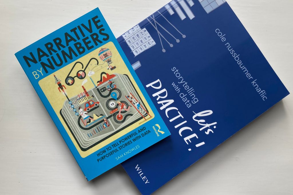
Narrative by Numbers: How to Tell Powerful and Purposeful Stories with Data
by Sam Knowles
2018, Routledge, 164 pages
Storytelling with Data: Let’s Practice!
by Cole Nussbaumer Knaflic
Wiley, 2020, 427 pages
While jargon may demonstrate expertise, it erodes trust in organisational storytelling.
Among the heroes and heroines of data visualisation, Knowles singles out two pioneers of public health from the nineteenth century: Florence Nightingale, who kept meticulous hospital records and developed new ways to present her findings; and Dr John Snow whose detailed London maps of deaths from cholera enabled the disease to be linked to poor water quality.
So much for science. In the final chapter, Knowles turns to post-truth in the light of Brexit-Trump (his shorthand for the two unexpected election results from the UK and US in 2016). ‘One of the defining aspects of Brexit-Trump was the fall and fall of facts and the growing lack of importance placed by candidates on evidence and data and, well, the truth.’
This has worried academics, pollsters and researchers yet leads Knowles to argue ‘we live at a time when facts have never mattered more… but arguments are not won by facts and facts alone.’
Knowles credits ‘former Googler Cole Nussbaumer-Knaflic’s 2015 book Storytelling with Data: A Data Visualisation Guide for Business’ as ‘one of the best, most accessible and most practical guides to show you how to communicate data and to tell a story.’
So I’ve taken a look at her recent book Storytelling with Data: Let’s Practice!.
There’s an obvious contrast between these two books. Knowles writes with brevity and has produced a small book, as befits a Brit. Nussbamer Knaflic’s is more of a large format workbook (the publisher describes it as an ‘immersive learning experience’), with limited text but plenty of visual examples. The scale comes from the Midwest of the United States.
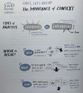
To lead by example, each chapter opens with a double page infographic summarising the contents. It’s an important message: in how to start big (with data and with ideas), but always ending up with something small (the story, the summary of the big idea, the visual).
This new book contains the practical exercises to enable readers to develop the ideas presented in her first book. Trainers and lecturers will find this a valuable resource.
If most of us working in public relations and communication are strong with words, then we’re typically weaker with numbers and with pictures. This book addresses these gaps with plentiful practical examples. I particularly welcomed the section on how our attention is attracted to the focal point of an image.
The author advises: ‘Your eyes and attention are a good initial proxy for your audience. After you create a graph or a slide, close your eyes and look away. Look back at it, taking note of where your eyes land first. Is this consistent with the place you want your audience to focus their attention first and foremost?’
In public relations, we’re writers and storytellers first; but we’re also required to be designers and photographers and data analysts.
On this last point, here’s the distinction between exploratory and explanatory analysis. ‘In a nutshell, exploratory is what you do to understand the data and explanatory is what you do to communicate something about the data to someone else.’ She takes this further, encouraging us to ‘move from exploratory dashboard to explanatory story’ and there are lessons in applying narrative arcs.
Her attention to detail is impressive. I rarely see any discussion of when to use capital letters in titles, but have noticed the US preference for Capitalising First Letters In Titles and the UK fashion for Sentence case where only the first letter is capitalised. Here’s her verdict: ‘For slide titles, I am in the habit of using sentence case (where the first letter is capitalized and the rest is lowercase). I do this because I think sentence case lends itself more easily to action… Be thoughtful and consistent in your use of letter case.’
Sam Knowles had raised the traditional educational divide between arts and science, citing CP Snow’s 1959 lecture on ‘The Two Cultures’. Knowles crossed the divide by moving from a classics degree to a doctorate in experimental psychology. Nussbaumer Knaflic has reached a similar point from the other direction: she’s a maths graduate with business experience who has acquired brilliant storytelling skills.
To spell out the lesson from these distinct but valuable books, the future belongs to those who can navigate these two cultures, turning exploratory data into explanatory stories that evoke emotion to drive engagement.