You really CAN judge a book by its cover: Exploring Internal Communication Fifth Edition

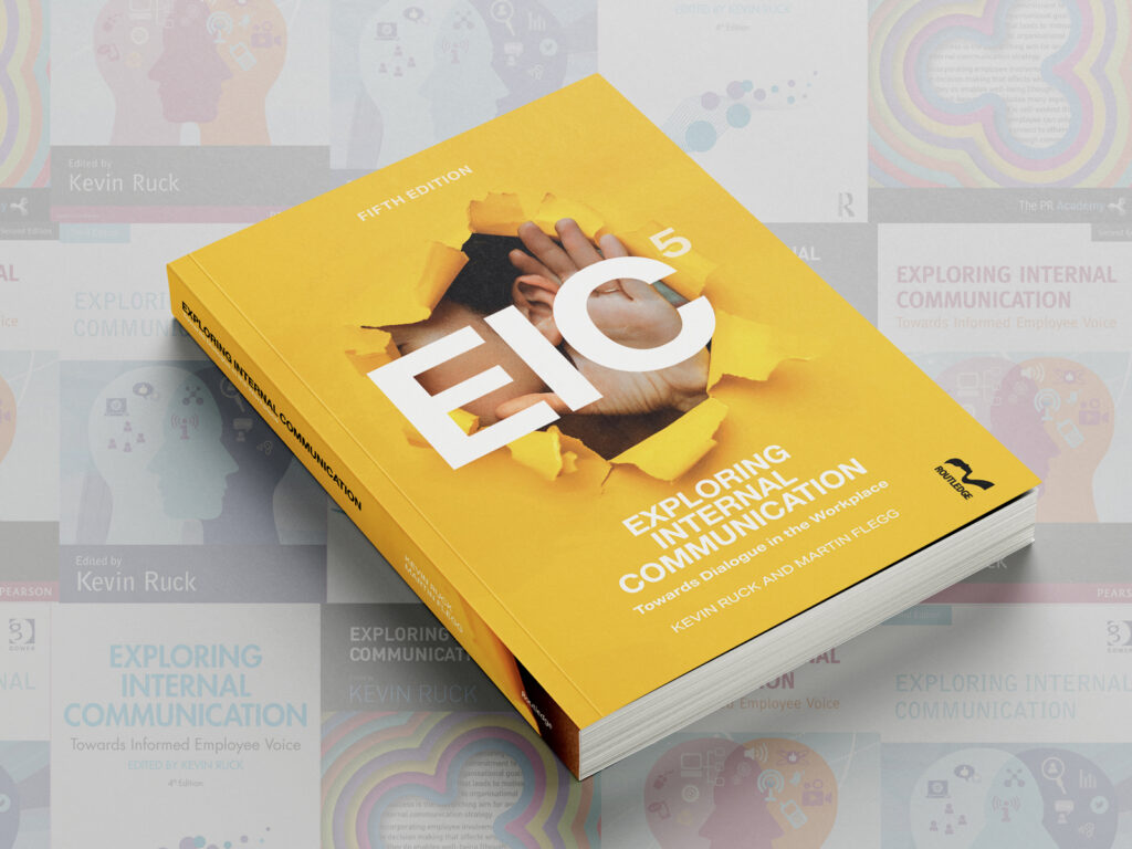
After more than a year of planning, researching and writing, both Kevin Ruck and I, are pleased to announce that the new edition of Exploring Internal Communication will be published by Routledge in March 2026.
In the run up to the publication date we’ll be sharing some insights into how we planned and wrote the fifth edition of this go-to book for internal communicators, as well as a few insights into what you’ll find within it.
The new edition will become the core text book for PR Academy’s CIPR internal communication courses.
Explore our internal communication courses
But, first, we’d like to unveil the cover design for EIC5, share how it was developed, and invite you to judge what is in our book by its cover!
There have been some tough decisions during the writing process because Exploring Internal Communication is a very well-established title, and we wanted to both preserve and build on the legacy of the previous editions.
As the fifth edition is a complete rewrite of the book, some of the things we debated included the topics and themes which would be included in it, which chapter each of us would be the lead author for and the options for sources, theory and research we would reference to underpin and develop our discussions.
However, what neither of us anticipated was how hard it would be to decide on a cover design!
We considered a plethora of themes and design elements featuring bees, honeycomb, scientific formulas, blurred images of office interiors, people in groups and individuals, birds, tin cans and string, wild rainbow colour schemes, design elements that looked like mould growing in petri dishes, and graphics and lettering reminiscent of video games from the 1980s. Looking back, some of this seems outlandish now, but it really did make us think!
The three distinctive designs also made us feel a bit nervous. Could we be courageous enough to go with something that was very different from the covers of the previous editions of the book?
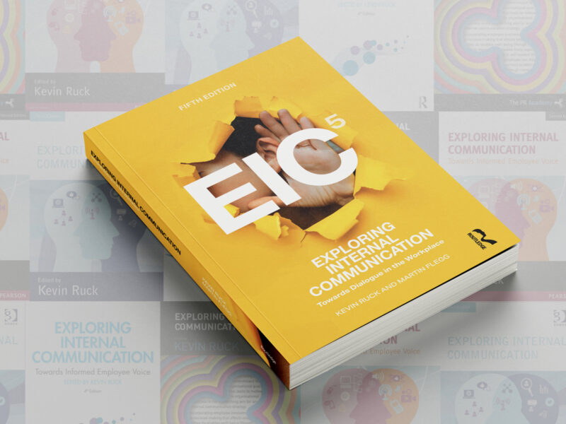
In the end, we decided to be brave, and the result is our bright yellow ‘breakthrough’ cover with a bold acronym. With Mark’s help we think that we have ended up with a cover design which is both eye catching and thought provoking and we hope that you like it as much as we do.